In the app world, redesigns and logo changes are inevitable to stay current and fresh in the ever-changing market. But with users reacting so negatively to most big name app redesigns and logo changes recently, it left us wondering, are successful app redesigns and logo changes even possible?
Having access to our own suite of awesome app review analysis tools on Appbot, we realised we were in a great position to find out, so here’s how the investigation went…
1. Big Name Redesigns & Logo Changes
We focussed our attention on 5 well-known apps who released a redesign or logo change in the last year or so; Instagram, Uber, YouTube, Medium, and Tumblr.
Let’s look at what they changed first.
A few months ago, Instagram released a large redesign of their iOS app, complete with a brand new logo. The app’s UI went from having splashes of colour to black and white while their logo went in the opposite direction, from a brown vintage camera, to a white camera outline with a blended flood of purple, pink and orange as the background (not unlike one of powerpoint’s old background gradient presets!).

In February this year, Uber unveiled their brand new logo, replacing their elegant upper case U with a chunky sideways U on a navy blue patterned background. Specifically, we’re looking into their Google Play app.

An update you’re probably familiar with is YouTube’s material design overhaul of their iOS app back in October 2015, with a few UX tweaks in there as well.

At around the same time as YouTube’s update, Medium also released their new app logo on iOS, replacing their black typeface M logo with a green M resembling a piece of folded paper.

Looking back a bit further, in April of 2015 Tumblr swapped out their flat ‘t’ logo for a three dimensional t with a shadow on their iOS apps. We chose this one because it represents a relatively minor change compared to some of the others we’re looking at.

2. So What Did Customers Think?
Looking into the app reviews for those apps a week or so after their updates, we quickly noticed a common theme emerging — people don’t like change.
Instagram’s average star rating plummeted from 3.1 to 2.4 the week after their redesign and logo change and their reviews were riddled with negative mentions of their UX, icon, and boring interface.
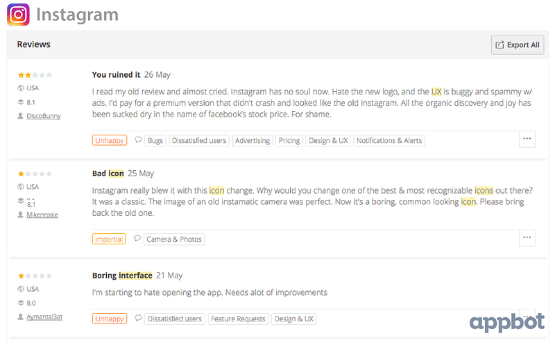
Uber’s logo change dropped their global average star rating from 3.9 to 3.8, a small difference but when we look exclusively at Design & UX reviews, the rating dropped from 3.2 to 2.9. In the weeks after the update, the main complaints in their app reviews were about design and UI.

When YouTube released their material design conversion in October 2015, their average star rating was already pretty low at only 2 stars, but a week after the update it had dropped down to 1.5 with users mainly complaining about the new UI.

We see the same story with Medium, their new icon dropped their average star rating from 4.1 stars to 3.9, with their users expressing complaints about the new logo.

Similarly, when Tumblr updated their icon back in April 2015, their rating also dropped from 4.1 stars to 3.9 and their users started complaining about the new icon.

3. What Happened After The Shock Subsided?
So the answer is simple, never make any UI or logo updates, right? Wrong! Take a look at what happened after the initial shock had settled down.
Two weeks after Instagram’s update, their star rating had returned to it’s original 3.1 stars and negative mentions of the new icon, boring interface and bad UX had all but vanished from reviews.
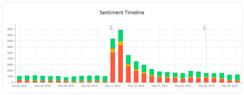
Similarly, 3 weeks after Uber’s new logo was launched, their average star rating was back to the original 3.9 stars, and negative design mentions while not gone completely, were back to the level they were before the update.
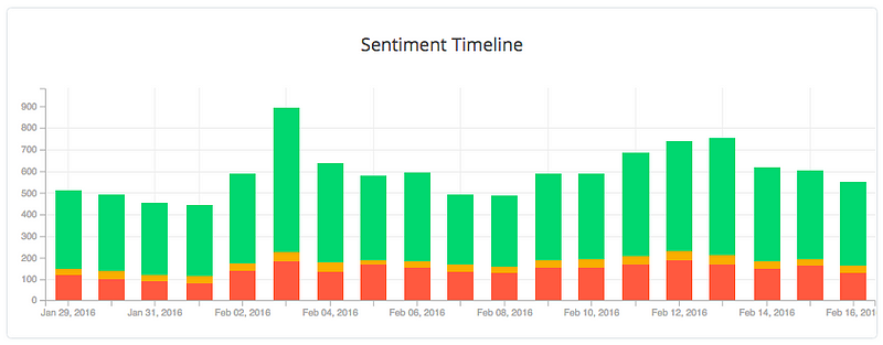
YouTube’s update took a bit longer for users to get used to, but sure enough, 4 weeks after their material design update, their average star rating had returned to it’s original 2 stars.
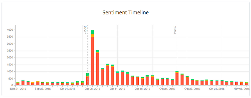
2 weeks after Medium’s icon update, their average star rating was back to 4.1 stars and negative mentions of their new logo were less and less prevalent in their reviews.
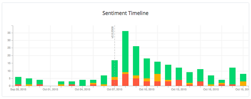
3 weeks after Tumblr’s icon update, their average star rating and reviews had… plummeted to 1 star? Nope! You guessed it, They had returned to normal.
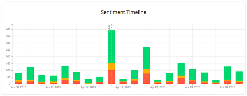
It’s worth mentioning here that none of these apps reverted back to their previous state in order to get their ratings back, it was all just time (and its ability to heal all wounds).
4. Did Users End Up Liking The Change?
So far we’ve established that it’s not uncommon for a design or logo change to yield an immediate negative reaction from users, and that more often than not the average star ratings return to their previous level within 4 weeks. The REAL question however is, of the apps we’ve investigated so far, how many ratings ended up swinging the other way? In other words, did people eventually start to LIKE the changes?
1 month after Instagram’s design and logo overhaul their rating had not only returned to the original 3.1 stars, but had climbed to 3.5 with people expressing positive feelings towards the new look!

Uber however has had a slightly different experience, it took 4 months for their average star rating to rise higher than their initial 3.9 star rating before the change, and even then there were next to no positive comments about their new logo, rather people had just stopped talking about it all together and moved on.

3 months after YouTube’s change, their rating was 0.3 stars higher than it was before their material design conversion and their users were now complementing them on their UI.

Next we move on to Medium, and after just one month, all mentions of their new logo had vanished entirely from their reviews, and their average star rating was now at 4.3 stars, even higher than the 4.1 stars it was at before they updated the logo.

Tumblr’s rating however has slowly been declining in the months since the initial recovery from the logo change, although looking into their reviews, there has been some positive talk about their new logo in the months after the initial shock settled down.

To Summarise…
So, what does this mean for redesigns? It means that when you’re releasing a UX or logo update, be ready for the negative response and know it’s mainly down to the users inherent fear of change. Monitor your reviews over the following 2–4 weeks and your review sentiment should hopefully stabilize the way it did for our examples above. If it hasn’t by week 4 then you might want to start looking further into what’s gone wrong, perhaps by using a tool like Appbot 🙂
Thanks for reading!
Thanks to Corey Ginnivan for the inspiration and initial research for this blog post!
Enjoyed this post? Please hit the ? button below.


 United States
 United Kingdom
 India
India Canada
 Singapore


![10 Benefits of the Internet of Things You Should Know [2025]](https://www.appstory.org/wp-content/uploads/2025/03/ATS-10-Benefits-of-the-Internet-of-Things-You-Should-Know-2025@2x-80x60.png)


